
The Complete Guide to Image Optimization for SEO and Performance in 2026
目录
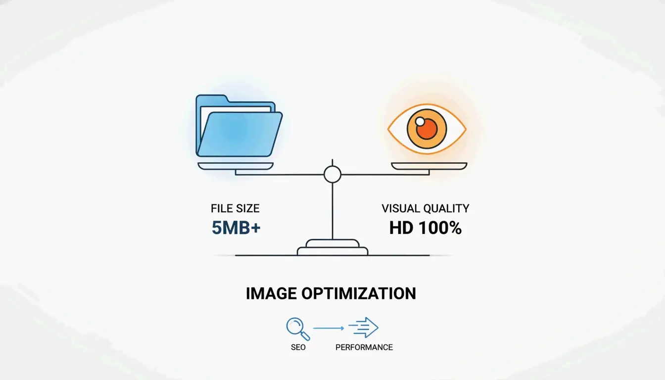
Image optimization means shrinking image file sizes and speeding up how they load, all while keeping visual quality intact. It directly improves page speed, Core Web Vitals, and search rankings. Key moves include resizing, compression, modern formats like WebP and AVIF, lazy loading, and writing good alt text.
Introduction: What is Image Optimization?
Image optimization is the process of tweaking images so they keep looking good but take up less space. According to Sanity, about 64% of a typical page’s weight comes from images. If you skip optimization, pages load slower, visitors bounce more, and satisfaction drops.
The main pieces of image optimization are:
– Resizing images to fit their display size
– Compressing files so they weigh less without obvious quality loss
– Picking modern formats like WebP and AVIF through format conversion
– Adding lazy loading for images not on the screen yet
– Writing descriptive alt text for accessibility and SEO
Online tools like ImageLean handle several of these steps at once—compression, format conversion across common image types, and local browser-based processing that keeps your files private without uploading anything to a server.
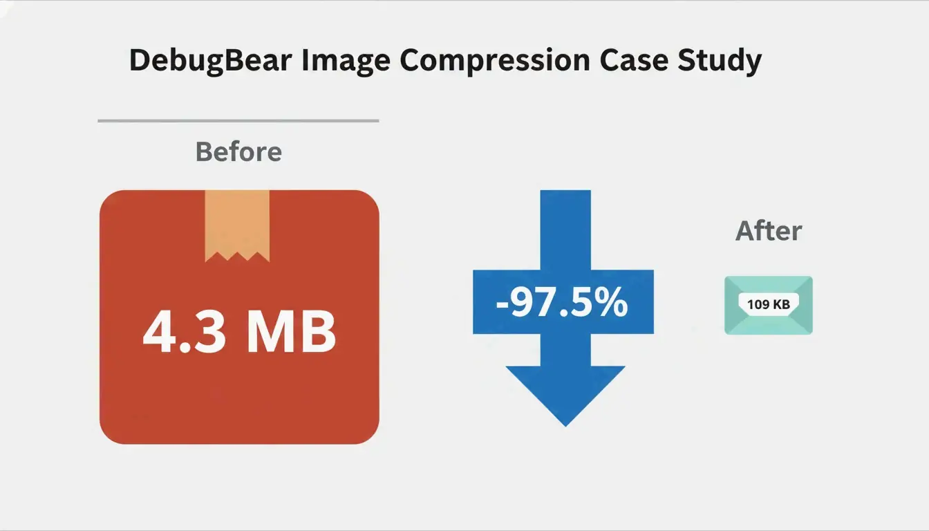
The difference can be huge. In a real example from DebugBear, a 4.3 MB image was cut down to just 109 KB—a 97.5% reduction—by resizing, compressing, and switching to AVIF.
Why Image Optimization Matters for SEO and User Experience
Image optimization touches three big areas: search rankings, how people feel using your site, and your bottom line. Since images make up about two-thirds of a page’s weight (per Sanity), skipping optimization means slower pages, lower rankings, and more people leaving.
How Image Optimization Affects Core Web Vitals
Google’s Core Web Vitals are performance metrics that impact your search placement. Largest Contentful Paint (LCP) measures how fast the main content shows up. Hero images, often the biggest thing above the fold, usually decide your LCP score. A bloated hero image can push LCP past the recommended 2.5 seconds.
Cumulative Layout Shift (CLS) is another metric that images can mess up. If your images don’t have explicit width and height attributes, the browser can’t reserve space before they load. When images finally render, they shove content around, annoying users and hurting your CLS. Setting dimensions in HTML prevents this mess.
Beyond Core Web Vitals, page speed itself is a confirmed ranking factor. Faster pages rank higher, especially in mobile search. Slow-loading images make people leave, which is worse on mobile where network speeds vary. Optimized images also save bandwidth and ease server load. Using a CDN can cut image load times by 50% or more for visitors far away, as DebugBear points out.
The Core Pillars of Image Optimization
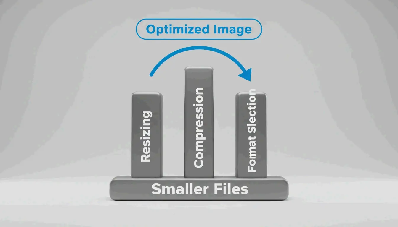
Image optimization comes down to three basics: Resizing, Compression, and Format Selection. Each attacks a different part of the file-size problem. Professional image processing tools combine these pillars into streamlined workflows that handle resizing, compression, and format conversion in a single pass.
How to Resize Images for the Web: Step by Step
Serving images at the size they’ll actually display is the single biggest win. A photo taken at 7108 x 4744 pixels (33.7 megapixels) might show up as only 1266 x 845 pixels on a desktop. Resizing it to match the display size drops the file from 4.3 MB to 495 KB—an 89% reduction, as seen in the DebugBear case study.
Here’s how to do it:
- Figure out your display dimensions: Check the max width your theme or layout uses for content areas. A good rule from WordPress.com is to upload images 1.5 to 2 times the content area width for crisp results.
- Resize before uploading: Use tools like Microsoft Paint (Windows), Preview (Mac), or GIMP to set the right dimensions. For batch jobs, Photoshop or Irfanview work well.
- Use responsive images: Add
srcsetandsizesattributes in HTML to serve different image versions based on screen size. DebugBear gives this example:
<img srcset="img-400.png 400w, img-800.png 800w, img-1600.png 1600w"
     sizes="(max-width: 600px) 400px, 800px" />
This lets the browser pick from three options (400px, 800px, or 1600px wide) depending on viewport width. Mobile users download smaller files, desktop users get crisp versions.
- Use the
<picture>element for trickier cases, like serving different formats or art-directed crops.
Lossy vs. Lossless Compression: When to Pick Which
Lossy compression permanently dumps some image data to make files smaller. The trade-off is possible quality loss, but at moderate settings (say JPEG quality 75-80%), most people can’t tell. Lossy is great for photos and complex images where a little detail loss is okay.
Lossless compression keeps every bit of original data, so files are larger. It preserves each pixel exactly. Use it for graphics with sharp lines, text, or transparency—logos, icons, screenshots, that kind of thing.
Modern formats like WebP and AVIF support both modes. For most web uses, lossy compression at quality 75 to 85 gives a sweet spot between file size and visual quality.
How to Set Up Lazy Loading and Responsive Images the Right Way
Lazy loading holds off loading images until they’re about to scroll into view. That way the browser doesn’t download off-screen images during the initial load, saving bandwidth and improving LCP.
Implementation is simple: add loading="lazy" to your image tags:
<img loading="lazy" src="image.jpg" alt="Description" />
Key rules:
- Don’t lazy-load above-the-fold images. Your LCP image should use
loading="eager"or just leave the lazy attribute off. Lazy-loading the hero image hurts LCP. - Prioritize in-viewport images with
fetchpriority="high"on your most important image. - For CSS background images, add a preload hint in the
<head>so the browser finds them early:
<link rel="preload" as="image" href="important-background.png" fetchpriority="high" />
Best Image Optimization Tools Compared for Different Workflows
Different setups call for different tools. Here’s a comparison of the most effective ones available in 2026, matched to specific use cases.
| Tool | Best For | Format Support | Batch Processing | Cost | API Access |
|---|---|---|---|---|---|
| Squoosh | Developers comparing formats | WebP, AVIF, JPEG, PNG | Yes | Free | No (browser-based) |
| TinyPNG | Designers optimizing single images | WebP, JPEG, PNG | Yes (up to 20 files) | Free | Yes (API key) |
| ImageLean | Privacy-focused browser compression | WebP, AVIF, JPEG, PNG | Yes | Free | No (browser-based) |
| Smush | WordPress site owners | WebP, AVIF, JPEG, PNG | Yes (bulk) | Free / Pro | No (plugin) |
| Cloudflare Images | Scaling with CDN delivery | Automated conversion | Yes (on-the-fly) | Pay-per-use | Yes |
| Next.js Image Component | React/Next.js developers | WebP, AVIF (automatic) | Automatic | Free (framework) | Built-in |
Squoosh (squoosh.app) is a free, browser-based tool that lets you tweak compression settings and see side-by-side previews before exporting. It’s great for developers who want to fine-tune.
TinyPNG (tinypng.com) uses smart lossy compression to shrink PNG and JPEG files. Simple, effective, perfect for designers working on individual images or small batches.
ImageLean is a free browser-based image optimization tool that processes everything locally on your device. It handles image compression, format conversion across common types (WebP, AVIF, JPEG, PNG), and resizing—without uploading your files to any server. This makes it a strong choice when privacy matters or when you need quick, no-sign-up optimization directly in your browser.
Smush (WordPress.org plugin) is the most popular WordPress image optimization plugin, used by over 1 million sites. It automatically compresses images on upload, supports bulk optimization, and includes lazy loading. The Pro version adds WebP/AVIF conversion, a global CDN with 119 servers, and automatic resizing to fix PageSpeed Insights warnings.
Cloudflare Images uses the Cloudflare image optimization pipeline to automatically optimize, resize, and convert images on the fly. Images are cached at Cloudflare’s edge, so you don’t need multiple resized copies. It’s ideal for scaling businesses with a global audience.
Next.js Image Component handles optimization automatically inside the Next.js framework. It serves correctly sized images for each device, uses modern formats like WebP, prevents layout shift, and enables lazy loading. For Next.js projects, this is often the simplest, best solution.
CDN-Based vs. Plugin-Based Image Optimization: Which Is Better?
CDN-based optimization (like Cloudflare Images or Fastly Image Optimizer) processes images at the network edge. When a browser asks for an image, the CDN checks its edge cache. If it’s there, it serves the optimized version instantly. If not, it fetches the original, applies transformations (format, width, quality), caches the result, and sends it. This approach requires zero manual work and ensures each visitor gets images tuned to their device and network.
Plugin-based optimization (like Smush or TinyPNG) processes images on your server or through an API before they’re stored. You get more control over the exact output, but you’ll need to run bulk processing on existing images periodically.
For most sites, a hybrid approach works best: use a CDN for on-the-fly delivery and a plugin for initial upload compression. As DebugBear notes, CDNs can cut image load times by 50% or more for international visitors.
Automating Image Optimization in Your Workflow
Manual optimization doesn’t scale. Modern workflows weave automation in at every stage.
Using CI/CD pipelines: GitHub Actions can automatically compress and convert formats whenever new images land in your repo. Tools like Squoosh CLI or sharp can be scripted to run on every push, ensuring all images in your codebase are optimized before deployment.
Headless CMS integration: Platforms like Sanity offer asset pipelines that serve optimized images with transformations applied on the fly. You store one high-quality source file, and the pipeline dishes out different versions for thumbnails, responsive sizes, and modern formats—no manual work.
Framework-specific components: The Next.js Image Component handles size optimization, visual stability, faster page loads, and asset flexibility automatically. It serves WebP, generates correct image sizes per device, and implements native lazy loading—all without extra config.
Automating Image Optimization for E-commerce Stores (Shopify & WooCommerce)
E-commerce sites are especially image-heavy. Product pages often show multiple high-res images, and thumbnails appear all over category pages and search results.
For WooCommerce: The Smush plugin integrates directly with WooCommerce, compressing product images automatically on upload. Its bulk optimization feature can handle existing product image galleries. The Pro version’s CDN speeds up global delivery.
For Shopify: Shopify’s built-in image pipeline automatically optimizes product images, but you can improve further by making sure source images are correctly sized before uploading. Most Shopify themes handle responsive images automatically, but check that your theme generates proper srcset attributes.
WebP vs. AVIF: The 2026 Decision Guide
Choosing between WebP and AVIF is one of the biggest image optimization decisions you’ll make. Both beat JPEG and PNG by a lot, but they have different strengths and trade-offs.
WebP advantages:
– Faster encoding (less server CPU time)
– Excellent browser support, including Safari 16.4+
– Good for time-sensitive images like LCP elements
– Both lossy and lossless modes
AVIF advantages:
– Better compression (typically 20% smaller than WebP)
– Supports HDR and wide color gamut
– Best when total page weight is the main concern
The trade-off: AVIF generally takes about 50% longer to encode than WebP but compresses images 20% smaller, according to Next.js documentation. So the first request is slower, but cached subsequent requests are faster.
For quick format conversion without server setup, browser-based tools like ImageLean let you optimize WebP images locally—reducing WebP file size efficiently without uploading to any cloud service.
Decision framework:
| Scenario | Recommended Format |
|---|---|
| LCP is critical and image is above the fold | WebP (faster encoding, wider support) |
| Total page weight is main concern | AVIF (better compression) |
| High-quality product photography | AVIF (better HDR support) |
| User-generated content | WebP (faster processing) |
| E-commerce category pages | AVIF (smaller thumbnails) |
Hybrid approach (recommended): Use a strategy like Framer: serve WebP on the first request, then convert to AVIF in the background. Once the AVIF version is ready, serve it for subsequent visits. You get fast initial delivery and smaller files for returning visitors.
When to Use WebP vs. AVIF for Different Image Types
Photographs: AVIF generally produces smaller files with better quality for natural images. Use it for product photos, hero images, and blog post imagery.
Graphics with text or sharp lines: WebP’s lossless mode can preserve text clarity better than AVIF. For logos, infographics, and screenshots, WebP lossless is often the safer bet.
Animated images: WebP supports animation; AVIF’s support for animation is still limited in browsers and tools. For animated graphics, stick with WebP.
How to Fix Common PageSpeed Insights Warnings
Google PageSpeed Insights flags specific image optimization issues. Here’s how to tackle each one.
“Properly size images”
This warning pops up when your image files are bigger than their display size—like serving a 4000px-wide image in a 400px-wide container.
Solution: Resize images to match the display dimensions, then use srcset to serve different sizes for different viewports. Tools like Smush can automatically resize images to fit their containers.
“Serve images in next-gen formats”
This warning means you’re using JPEG or PNG when WebP or AVIF would produce smaller files.
Solution: Convert images using Squoosh or an automated tool. For WordPress sites, Smush can convert to WebP and AVIF automatically. For Next.js sites, the Image Component handles this automatically.
“Defer offscreen images”
This warning means the browser is downloading images that aren’t yet visible.
Solution: Add loading="lazy" to all below-the-fold images. Make sure your LCP image (usually the hero) does not have lazy loading enabled, because that delays its download.
“Eliminate render-blocking resources”
Large images can block rendering, especially when embedded as Base64 data URLs in CSS or HTML.
Solution: Avoid Base64 encoding for images bigger than a few hundred bytes. Instead, serve images as separate files. DebugBear points out that Base64 data URLs bloat HTML file size, slowing down parsing and rendering.
Conclusion
Image optimization isn’t just about making files smaller—it’s a core part of modern web performance that directly affects SEO, user experience, and business metrics. One unoptimized image can undo months of work.
Start today by auditing your existing images with a tool like DebugBear. Then roll out a tiered strategy: resize images to their display size, compress them with lossy compression at sensible quality levels, convert to modern formats (WebP or AVIF), and automate the whole thing with a CDN or CMS plugin. Browser-based tools like ImageLean make it easy to test compression and format conversion right away—no account, no upload, everything processed locally on your device. The 97.5% reduction from the DebugBear case study is within reach for most sites—but only if you actually take the first step.
FAQ
What is the difference between lossy and lossless compression for images?
Lossy compression permanently removes image data to achieve smaller file sizes, making it ideal for photographs where slight quality loss is acceptable. Lossless compression preserves all image data, resulting in larger files better suited for graphics with sharp lines or text. Modern formats like WebP and AVIF support both modes.
Should I use WebP or AVIF for my website in 2026?
WebP is faster to encode and has wider browser support, making it ideal for time-sensitive images like heroes or LCP elements. AVIF offers even better compression (smaller files) but has slower encoding, making it best for total page weight reduction. Consider a hybrid approach: serve WebP on the first load, then convert to AVIF in the background.
How do I fix “Properly size images” and “Next-gen format” warnings in Google PageSpeed Insights?
To fix “Properly size images,” resize your image files to match the display size in your HTML/CSS. To fix “Next-gen format,” convert your JPEG and PNG files to WebP or AVIF using a tool like Squoosh. Use a responsive image setup with srcset and the <picture> element to serve the most appropriate version based on screen size and format support.